The logo achieves all the company's goals, which are:
Expressing the company's identity in a unique way, giving an impression of modernity, innovation, professionalism and excellence, and an impression of trust and reliability.
Expressing the company's identity in a unique way, giving an impression of modernity, innovation, professionalism and excellence, and an impression of trust and reliability.
Logo Word:
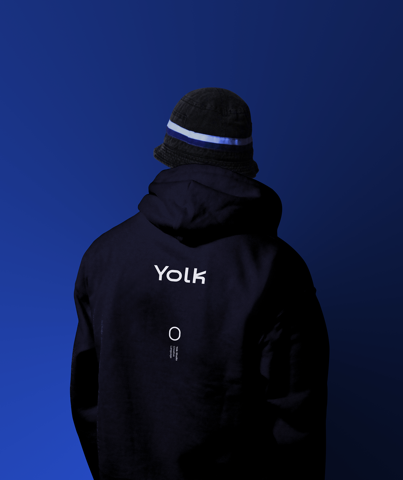
The logo word is carefully designed in a modern and technical form, the logo features the letter k which comes in the shape of a movie clapper. The letter o clearly represents the shape of the yolk.
The logo word is carefully designed in a modern and technical form, the logo features the letter k which comes in the shape of a movie clapper. The letter o clearly represents the shape of the yolk.
Font:
The simple and modern MADE Outer font was used. To suit the logo and its employment style.
The simple and modern MADE Outer font was used. To suit the logo and its employment style.
Colors:
Blue and midnight black were used in several shades. Where the blue color gives the impression of loyalty and honesty, and the midnight black color gives the impression of strength and solidity. Different shades of blue and midnight black were each used to give
Blue and midnight black were used in several shades. Where the blue color gives the impression of loyalty and honesty, and the midnight black color gives the impression of strength and solidity. Different shades of blue and midnight black were each used to give
the impression of intelligence and creativity.